לקוד html יש הרבה פקדים לקבלת מידע מהמשתמש. ל-react native יש הרבה פחות אפשרויות. ל-expo יש ספרייה שמרחיבה את האפשרויות. מעבר לאפשרויות של react native יש ספריות שמטפלות בטפסים.
TextInput
ההוספה הבסיסית של TextInput. על מנת לראות את הרכיב יש צורך לעצב אותו.
<SafeAreaView style={styles.safeContainer}>
  <TextInput style={styles.input} />
</SafeAreaView>
...
input: {
  height: 40,
  margin: 12,
  padding: 10,
  borderWidth: 1
}
על מנת לקבל את הערך שהוכנס נשתמש ב-state.
import { Text, SafeAreaView, StyleSheet, View, StatusBar, TextInput } from "react-native";
import { useState } from "react";

export default function Index() {
  const [name, setName] = useState("");

  return (
    <SafeAreaView style={styles.safeContainer}>
      <TextInput style={styles.input} value={name} onChangeText={setName} />
      <Text>Name is {name}</Text>
    </SafeAreaView>
  );
}
TextInput Props
placeholder – טקסט הדרכה בתוך תיבת הטקסט.
secureTextEntry – הופך את הקלט לנקודות או כוכביות להסתיר אותו.
keyboardType – שינוי המקלדת שתופיע כאשר מכניסים תוכן. למשל numeric יתן מקלדת של מספרים.
<TextInput style={styles.input} value={name}
  onChangeText={setName}
  placeholder="Enter you name"
  secureTextEntry
  keyboardType="numeric"
/>
autoCorrect – האם לאפשר תיקון אוטומטי של טקסט, להוריד במקרה של שם משתמש וסיסמא.
autoCapitalize – האם לאפשר תיקון אות ראשונה לגדולה.
<TextInput style={styles.input} value={name}
  onChangeText={setName}
  placeholder="Enter you name"
  autoCorrect={false}
  autoCapitalize="none"
/>
Multiline TextInput
כדי ליצור תיבת טקסט עם מספר שורות נשתמש ב-TextInput עם הגדרת multiline.
<TextInput style={[styles.input, styles.multilineText]}
  multiline
  placeholder="Message"
/>
...
multilineText: {
    minHeight: 100,
    textAlignVertical: "top"
}
Switch
קומפוננטה לבחירת מצב אחד מבין שניים.
<View style={styles.switchContainer}>
  <Text>Dark Mode</Text>
  <Switch />
</View>
...
switchContainer: {
  flexDirection: "row",
  alignItems: "center",
  justifyContent: "space-between",
  paddingHorizontal: 10
}
אנחנו נראה את הקומפוננטה של המסך, אבל כדי שהיא תעבוד צריך לחבר אותה ל-state.
const [isDarkMode, setIsDarkMode] = useState(false);

<Switch
  value={isDarkMode}
  onValueChange={() => setIsDarkMode((previousState) => !previousState)}
  trackColor={{false: "#767577", true: "lightblue"}}
  thumbColor="#f4f3f4"
/>
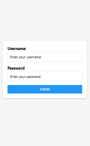
Login Form
נבנה טופס login. נתחיל מבנייה בסיסית של הפקדים בטופס וכפתור לאישור.
import { Text, SafeAreaView, StyleSheet,
  StatusBar, TextInput, View, Button } from "react-native";

export default function Index() {

  return (
    <SafeAreaView style={styles.safeContainer}>
      <View style={styles.formContainer}>
      <Text style={styles.label}>Username</Text>
        <TextInput
          style={styles.input}
          placeholder="Enter your username"
        />

        <Text style={styles.label}>Password</Text>
        <TextInput
          style={styles.input}
          placeholder="Enter your password"
          secureTextEntry
        />

        <Button title="Login" onPress={() => {}} />
      </View>
    </SafeAreaView>
  );
}

const styles = StyleSheet.create({
  safeContainer: {
    flex: 1,
    backgroundColor: "#f5f5f5",
    justifyContent: "center",
    paddingHorizontal: 20,
    // Will add padding only in andoird
    paddingTop: StatusBar.currentHeight
  },

  formContainer: {
    backgroundColor: "#ffffff",
    padding: 20,
    borderRadius: 10,
    shadowColor: "#000",
    shadowOffset: {
      width: 0,
      height: 2,
    },
    shadowOpacity: 0.25,
    shadowRadius: 3.84,
    elevation: 5,
    margin: 20
  },

  label: {
    fontSize: 16,
    marginBottom: 5,
    fontWeight: "bold",
  },
  input: {
    height: 40,
    borderColor: "#ddd",
    borderWidth: 1,
    marginBottom: 15,
    padding: 10,
    borderRadius: 5,
  },
})
כדי לעקוב אחרי קלט המשתמש נשתמש ב-useState.
const [username, setUsername] = useState("");
const [password, setPassword] = useState("");
...
<Text style={styles.label}>Username</Text>
<TextInput
  style={styles.input}
  placeholder="Enter your username"
  value={username}
  onChangeText={setUsername}
/>

<Text style={styles.label}>Password</Text>
<TextInput
  style={styles.input}
  placeholder="Enter your password"
  secureTextEntry
  value={password}
  onChangeText={setPassword}
/>
KeyboardAvoidingView
יש בעיה עם טפסים במכשירים ניידים, שאם לוחצים על שדה קלט והוא נמצא למטה במסך, המקלדת שקופצת מכסה את שדה הקלט והמשתמש לא רואה אותו. אם נוסיף תמונה שתדחף את התוכן למטה, נראה את זה קורה. הפתרון הוא להשתמש ב-KeyboardAvoidingView.
נחליף את ה-View שעוטף את הכל ב-KeyboardAvoidingView.
<KeyboardAvoidingView
    behavior="padding"
    keyboardVerticalOffset={Platform.OS === "ios" ? 100 : 0}
    style={styles.mainContainer}
>
...
</KeyboardAvoidingView>
השימוש ב-keyboardVerticalOffset הוא על מנת להעלות את התוכן עוד קצת למטה ב-IOS, מכיוון שאם יש הרבה תוכן, הקלט נמצא עדיין למטה.
Form Validation
ניצור state לאחסן את הודעות השגיאה. נכתוב את הפונקציה validateForm שתחזיר הודעת שגיאה או true אם הכל בסדר.
const [errors, setErrors] = useState({username: '', password: ''});

const validateForm = () => {
  let errors = {username, password};

  if (!username) errors.username = "Username is required";
  if (!password) errors.password = "Password is required";

  setErrors(errors);

  return Object.keys(errors).length === 0;
};
את הודעות השגיאה נציג על המסך.
<View style={styles.formContainer}>
  <Image style={styles.formLogo}
    source={require("../assets/images/epic-logo.png")}/>

  <Text style={styles.label}>Username</Text>
  <TextInput
    style={styles.input}
    placeholder="Enter your username"
    value={username}
    onChangeText={setUsername}
  />
  {
    errors.username ? (<Text style={styles.errorText}>{errors.username}</Text>) : null
  }

  <Text style={styles.label}>Password</Text>
  <TextInput
    style={styles.input}
    placeholder="Enter your password"
    secureTextEntry
    value={password}
    onChangeText={setPassword}
  />
  {
    errors.password ? (<Text style={styles.errorText}>{errors.password}</Text>) : null
  }

  <Button title="Login" onPress={() => {}} />
</View>
Form Submission
נגדיר את הפונקציה שמבצעת את רישום הטופס. את הפונקציה נחבר לאירוע ההגשה של הטופס.
...
const handleSubmit = () => {
    if (validateForm()) {
      // Usually will go to the api
      console.log("Submitted", username, password);
      setUsername("");
      setPassword("");
      setErrors({username: '', password: ''});
    }
};
...
<Button title="Login" onPress={handleSubmit} />