Widget Module
Widget Module מגדיר קומפוננטות שמיועדות לשימוש חוזר במודולים שונים. למשל, נניח שיש לנו כותרת עם אלמנטים מסויימים שחוזרת לאורך כל המודולים, אנחנו יכולים להכניס אותה לרכיב אחד שבו נשתמש לאורך כל התוכנית.
למודול שמכיל את הקומפוננטות האלה נהוג לקרוא Shared Module.
נתחיל עם יצירת המודול:
ng g m shared
ואחר כך ניצור את הקומפוננטה שאנחנו רוצים שתהיה משותפת, במקרה הזה כותרת עם פס.
ng g c shared/divider
נכניס את הקוד שרוצים לתוך קובץ התבנית של הקומפוננטה.
קובץ divider.component.html
<h2>Custome headline</h2>
<hr class="pt-2 pb-2">
שימוש גלובלי בקומפוננטה
כדי להשתמש בקומפוננטה של מודול חיצוני, צריך לבצע לה export.
קובץ shared.module.ts
@NgModule({
  declarations: [
    DividerComponent
  ],
  imports: [
    CommonModule
  ],
  exports: [
    DividerComponent
  ]
})
עכשיו המודול שמשתמש בקומפוננטה המשותפת צריך לעשות import למודול.
קובץ elements.module.ts
@NgModule({
  declarations: [
    ElementsHomeComponent,
    PlaceholderComponent
  ],
  imports: [
    CommonModule,
    ElementsRoutingModule,
    SharedModule
  ],
  exports: []
})
עכשיו אפשר להשתמש בקומפוננטה המשותפת.
קובץ elements.component.html
<app-divider></app-divider>
<app-placeholder [showImage]="true" [placeholderW]="'400px'"></app-placeholder>
עכשיו מה שצריך זה לגרום לכותרת להיות דינמית לפי העמוד שנמצאים בו.
אפשר להשתמש במשתנה שמקבל מידע מהורה לילד על ידי Input. יהיה יותר ידידותי אם יהיה אפשר לכתוב את התוכן בתוך הרכיב עצמו.
ngContent
נשתמש בתג מיוחד שנקרא ngContent. כל תוכן שנמצא בתוך התגים של הקומפוננטה ילקח ויהיה בתוך שומר המקום של ng-content בקומפוננטה.
קובץ divider.component.html
<h2>
  <ng-content></ng-content>
</h2>
<hr class="pt-2 pb-2">
קובץ elements.component.html
<app-divider>
  Placeholder Component
</app-divider>
<app-placeholder [showImage]="true" [placeholderW]="'400px'"></app-placeholder>
התאמת איזורים מרובים בקומפוננטה
נראה איך אנחנו מייצרים עוד קומפוננטה לשימוש חוזר עם התאמה של המשתמש לצרכים שלו.
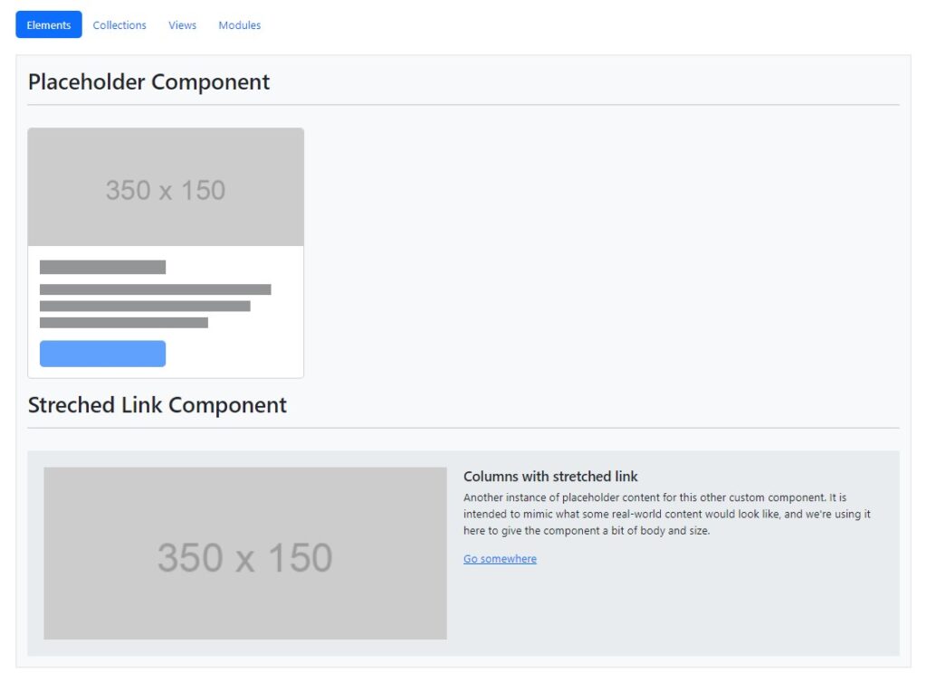
ניצור עוד קומפוננטה בשם streched link בתוך תיקיית elements. אני משתמשת פה בתבנית של bootstrap לאלמנט Stretched link.
קובץ streched-link.component.html
<div class="row g-0 bg-body-secondary position-relative">
  <div class="col-md-6 mb-md-0 p-md-4">
    <img src="https://via.placeholder.com/350x150" class="w-100">
  </div>
  <div class="col-md-6 p-4 ps-md-0">
    <h5 class="mt-0">Columns with stretched link</h5>
    <p>Another instance of placeholder content for this other custom component.
    It is intended to mimic what some real-world content would look like,
    and we're using it here to give the component a bit of body and size.</p>
    <a href="#" class="stretched-link">Go somewhere</a>
  </div>
</div>
את האלמנט נוסיף לעמוד הבית של מודול elements.
קובץ elements.component.html
<app-divider>
  Placeholder Component
</app-divider>
<app-placeholder [showImage]="true" [placeholderW]="'400px'"></app-placeholder>

<div class="mt-3"></div>

<app-divider>
  Streched Link Component
</app-divider>
<app-streched-link></app-streched-link>
כדי שהקומפוננטה הזאת תתאים לשימוש חוזר, אנחנו רוצים שתהיה אפשרות לערוך את הטקסטים, להחליט איזה תמונה יש, האם רוצים להציג קישור ועוד.
יש פה אתגר בהתאמה מכיוון שיש פה הרבה חלקים שצריך להתאים ומצד שני אנחנו רוצים להשאיר את התבנית הכללית. אם נשתמש ב-ng-content נצטרך לכתוב את כל הקוד של הקומפוננטה בתוך האיזור של התג של הקומפוננטה בתבנית האב, מה שמפספס קצת את השימוש החוזר הקל.
במקום זה נשתמש באפשרות select להבאת איזורי תוכן.
נניח שאני רוצה להתאים את הקישור של התמונה, בקובץ הקומפוננטה, במקום להשתמש בתגית img, אני מפחנה ל-content שמכיל את התגית img.
<ng-content select="img"></ng-content>. זה יראה כך:
קובץ streched-link.component.html
<div class="row g-0 bg-body-secondary position-relative">
  <div class="col-md-6 mb-md-0 p-md-4">
    <ng-content select="img"></ng-content>
  </div>
  <div class="col-md-6 p-4 ps-md-0">
    <h5 class="mt-0">Columns with stretched link</h5>
    <p>Another instance of placeholder content for this other custom component.
    It is intended to mimic what some real-world content would look like,
    and we're using it here to give the component a bit of body and size.</p>
    <a href="#" class="stretched-link">Go somewhere</a>
  </div>
</div>
בקובץ שבו אני קוראת לקומפוננה אני אשים את תגית img. ה-content יחפש את התגית להחלפה עם מה שהוא צריך בתבנית הקומפוננטה.
קובץ elements.component.html
<app-divider>
  Streched Link Component
</app-divider>
<app-streched-link>
  <img src="https://via.placeholder.com/350x150" class="w-100">
</app-streched-link>
נחליף את שאר הרכיבים. ונראה את הקוד המלא.
קובץ streched-link.component.html
<div class="row g-0 bg-body-secondary border rounded position-relative">
  <div class="col-md-6 mb-md-0 p-md-4">
    <ng-content select="img"></ng-content>
  </div>
  <div class="col-md-6 p-4 ps-md-0">
    <ng-content select="h5"></ng-content>
    <p><ng-content></ng-content></p>
    <ng-content select="a"></ng-content>
  </div>
</div>
קובץ elements.component.html
<app-divider>
  Streched Link Component
</app-divider>
<app-streched-link>
  <img src="https://via.placeholder.com/350x150" class="w-100">
  <h5 class="mt-0">Columns with stretched link</h5>

  Another instance of placeholder content for this other custom component.
    It is intended to mimic what some real-world content would look like,
    and we're using it here to give the component a bit of body and size.

  <a href="#" class="stretched-link">Go somewhere</a>
</app-streched-link>
אפשר להשתמש בפעולה ה-select גם בהפנייה ל-attribute של התג או על ידי הפנייה ל-class. פנייה לפי רכיבים כמו למעלה תהיה בדרך כלל ברורה יותר למי שמשתמש בקומפוננטה.
קובץ streched-link.component.html
<div class="row g-0 bg-body-secondary border rounded position-relative">
  <div class="col-md-6 mb-md-0 p-md-4">
    <ng-content select="[link-img]"></ng-content>
  </div>
  <div class="col-md-6 p-4 ps-md-0">
    <ng-content select=".link-header"></ng-content>
    <p><ng-content></ng-content></p>
    <ng-content select="a"></ng-content>
  </div>
</div>
קובץ elements.component.html
<app-divider>
  Streched Link Component
</app-divider>
<app-streched-link>
  <img link-img src="https://via.placeholder.com/350x150" class="w-100">
  <h5 class="mt-0 link-header">Columns with stretched link</h5>

  Another instance of placeholder content for this other custom component.
    It is intended to mimic what some real-world content would look like,
    and we're using it here to give the component a bit of body and size.

  <a href="#" class="stretched-link">Go somewhere</a>
</app-streched-link>
הסתרת אלמנטים ריקים
בקובץ תבנית הקומפוננטה יש לנו div שבתוכו יש את התמונה. מה קורה אם לא מסופק תוכן לתמונה? התמונה לא תופיע אבל ה-div ישאר ויקח את המקום שלו. הייתי רוצה שכל ה-div הזה יעלם.
פתרון קל הוא לשים class ל-div הזה ולפנות אליו בקובץ ה-css.
קובץ streched-link.component.css
div.img-content:empty{
  display: none;
}
עכשיו אם ה-div ריק הוא לא יוצג.